Ventura’s System Settings
I have to admit, when I saw screenshots of Ventura’s new System Settings stuff, I was very unimpressed. It looked too much like you would see on Windows or Linux for me.
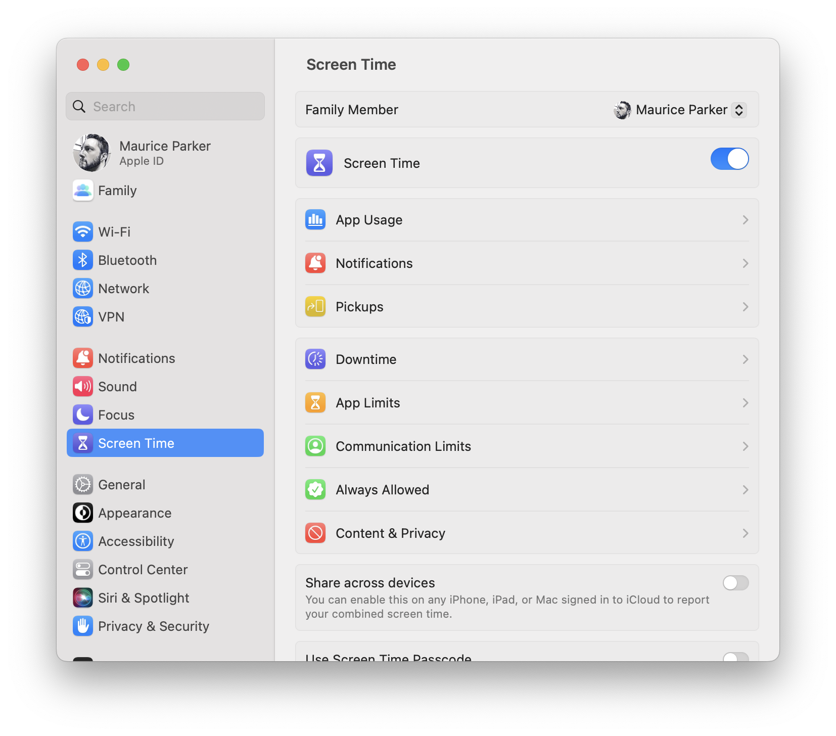 

Now that I’ve actually used it, I appreciate the design decision that was made. I know a lot of people were critical, myself included, about basing the design of the System Settings on the iOS ones. But making it like the iOS ones reduces cognitive load when switching back and forth a lot more than I thought it would. I can find the setting that I want much easier now.
There is a lot to criticize though. It feels clunky, like it is missing some animations. For example, if you have the right pointing chevron, it should animate you that direction. I know that style of navigation sounds very iOS like, but the column view in Finder works that way too.
It also doesn’t feel like it fits in quite right with the rest of macOS. I haven’t read Apple’s HIG yet this year so that could be it. My guess is that we will see the rest of the move more this direction again next year.
Because so many more people own an iPhone than a Mac, making Macs easier for iPhone owners to use is a good strategy. Lots of the same people who are critical of recent macOS changes are also the same ones who are frustrated that Apple isn’t doing enough to grow the Mac user base. It looks like Apple is working to leverage the popularity of the iPhone and the iPad to win over users. Between that and the new Mac hardware, it looks to me like they are very focused on the success of the Mac.